Achieving Flight: Discerning Between Correlation And Causality in American Healthcare

In the opening chapters of How Will You Measure Your Life, Clayton Christensen illustrates why hundreds of years of attempts to fly were unsuccessful and what changed that got the Wright Brothers off of the ground.

“Early researchers observed strong correlations between being able to fly and having feathers and wings. Stories of men attempting to fly by strapping on wings date back hundreds of years. They were replicating what they believed allowed birds to soar: wings and feathers.

“Possessing these attributes had a high correlation—a connection between two things—with the ability to fly, but when humans attempted to follow what they believed were “best practices” of the most successful fliers by strapping on wings, then jumping off cathedrals and flapping hard … they failed. The mistake was that although feathers and wings were correlated with flying, the would-be aviators did not understand the fundamental causal mechanism—what actually causes something to happen—that enabled certain creatures to fly.”

“The real breakthrough in human flight didn’t come from crafting better wings or using more feathers. It was brought about by Dutch-Swiss mathematician Daniel Bernoulli and his book Hydrodynamica, a study of fluid mechanics. In 1738, he outlined what was to become known as Bernoulli’s principle, a theory that, when applied to flight, explained the concept of lift. We had gone from correlation (wings and feathers) to causality (lift).”

Reading through the passage, I immediately connected this principle with the US’s attempts to implement a national healthcare system.

Now, currently, no policy makers are making moves on Medicare for All. The country is nine weeks into a pandemic. Some states are slowly and cautiously reopening, and it seems we’re going to be in The Dance for another six to eighteen months. Oh, and in case you’ve forgotten, we’re six months away from a presidential election. Medicare for All isn’t at the top of our list of problems.

But once the political and healthcare dust has settled, the debate (or online rage-fest) of a national healthcare system will startup again. I wouldn’t be surprised to see both sides using the pandemic to support their position.

After reading the above passage from Christensen, I wondered. Would mimicking what other countries have done be like strapping wings on American healthcare system? Or would it be like applying the principles of lift? Will doing what other countries have done solve our problems?

What exactly are the problems the US system faces?

For one, value (measured in quality over cost) is low. Costs are higher than anywhere else in the OECD countries. And for all that extra money, outcomes seem about the same or worse. Second, roughly 27.5 million Americans (about 8.5%) are uninsured, which distributes costs to the rest of the system. Third, the incentives between who payers, patients, and providersmeans that consumers and providers often make decisions free of the monetary consequences of their choices, decreasing the power of free market tactics to cutting costs or improving quality.

In addition to our system’s issues, the US is unlike other OECD countries in its geographic and medical makeup. At 327.2 million citizens, we’re fifty times larger than the UK (6.5 million), and sixty times larger than Norway (5.5 million). About sixty million Americans (19.3%) live in rural areas where expensive healthcare services are harder to efficiently distribute. Add to the population issues a host of medical problems the country struggles with. For example, we’re close to the top of the list of most obese countries, with 36.2% of the population at a Body Mass Index of 30 or higher. Compare that to Canada (29.2%), Mexico (28.9%), and the UK (27.8%).

The unique problems and characteristics of the United States are significant. The ideal US healthcare system will need to be different from those of other countries that don’t share similar challenges. In other words, policy makers will need to craft incentives and systems to suit our unique situation in order to achieve flight, and not just mimick the surface characteristic of the healthcare systems of the OECD countries.

Unemployment, An Update

Published Friday, May 1, 2020 as an update to the post Visualizing the Unprecedented Speed and Size of Unemployment.

Unemployment numbers from the last two weeks are in. According to the department of labor, as reported by CBS, the week of April 18th saw 4.4 million claims, and the week of April 25th saw 3.8 million.

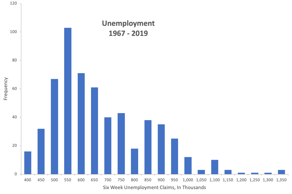
I went back to the data from the previous post and reran the numbers. To get a single-number comparison, I reran the numbers in six-week increments. This histogram shows unemployment from every six-week period from 1967 to the end of 2019.

The minimum is about 400,000 claims, the maximum 1,350,000 claims, and the mean 649,000 claims per six-week period. The standard deviation in the distribution is 180,000. Add in the last six weeks, which have seen 30,307,000 file for unemployment, and the histogram looks like this:

The data point from the last six weeks is so far above the rest of the distribution it’s nearly invisible (sorry for making you squint), so I painted it in.

That data point of the 30.3 million unemployed sits 164.3 standard deviations above the mean. And that’s not a typo. One hundred and sixty four point three standard deviations above the mean.

And if there were a line of the unemployed, everyone standing six feet apart, the line would be 34,439 miles long. It would stretch from Boston, to Seattle, to San Diego, to Miami, and back to Boston four times.

Economists anticipate three potential ways to recover from the current economic crisis, represented by the letters V, U, and L. The first would be a fast return to where we were economically before January. A U-shaped recovery is more gradual. An L-shaped recovery would be a slow return to economic normal.

I have no crystal ball, but given the unemployment numbers we’ve seen in the last six weeks, I anticipate something between a stretched U and an L-shaped recovery.

Visualizing the Unprecedented Speed and Size of Unemployment

As of the latest report from the New York Times, 22,034,000 Americans filed for unemployment benefits in the last four weeks. That’s a massive number of people–so massize that human minds struggle to comprehend just how large and how fast those claims are being filed. We can compare it to the Great Recession, where it took two years for 8 million Americans to lose their jobs. Translating data from numbers to a visual might help illustrate just how fast and how large the the unprecedented unemployment numbers are. 

Unprecedented Speed

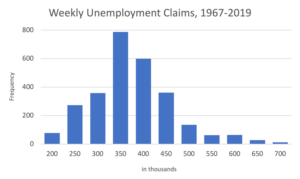
The rate at which Americans are filing for unemployment is literally off the chart. First, let’s take a look at unemployment claims per week going back to January 1967 (when the Department of Labor started keeping track of weekly claims) up until December 2019. (Source data downloadable here.)

The average claims filed per week falls somewhere around 350,000, with a minimum of about 200,000, and a maximum of approximately 700,000.

Where do the last four weeks fall on this histogram?

To fit data from the last four weeks into the histogram, we have to smash the previous 53 years of data to the far left. It’s visually clear that recent unemployment data is far above anything previously, but how far above, precisely?

Statisticians use a measure called standard deviation (represented with the Greek letter sigma) to measure how far away from the mean a particular observation is. When speaking of standard deviations, we’re usually dealing with single digits. In a standard normal distribution, 99.7% of all data points fall within three standard deviations below and three standard deviations above the mean. Six Sigma, a technique of improving processes until they’re 99.99966% efficient, is so named because the idea six standard deviations is extreme. 

Using standard deviations, how abnormal are the last four weeks of unemployment claims? The week ending March 21, which saw 2.92 million applications for unemployment, was 29 standard deviations above the mean. The week ending April 4, which saw 6.21 million applications, was 66 standard deviations above the mean. The United States has never before seen unemployment at this speed. 

Size 

To comprehend the enormity of unemployment claims, let’s translate 22,034,000 into a map. What if we took everyone who’s filed for unemployment and lined them up, in an appropriate-for-social-distancing line, everyone six feet apart, starting in Boston? How long do you think that line would be? 

The line of unemployed adults would stretch from Boston to Seattle.

Then down to San Diego.

Then over to Miami.

And back up to Boston…

THREE TIMES!

(Technically, you would finish the line 300 miles short of Boston on the last lap, BUT STILL). The line would be 25,038 miles long. 

If you drove with your hand out the driver’s side window, at 75 miles per hour, high-fiving everyone in that line (something I don’t recommend for several reasons), it would take two full weeks to get to the end of the line. That’s two weeks with no stopping for bathroom breaks, no stopping for food, and no stopping for gas. 

Economic Momentum

In physics, the effect one moving object will have on another is calculated using momentum, defined by multiply mass (size) times velocity (speed). The two visualizations above demonstrate the size and speed of the recent shock to USA employment. Given the economic momentum of the last four weeks, I think it’s going to take some time for the country’s economy to recover.

Update

I’ve rerun the numbers with two more weeks of unemployment claims, comparing six week intervals, posted here.