As of the latest report from the New York Times, 22,034,000 Americans filed for unemployment benefits in the last four weeks. That’s a massive number of people–so massize that human minds struggle to comprehend just how large and how fast those claims are being filed. We can compare it to the Great Recession, where it took two years for 8 million Americans to lose their jobs. Translating data from numbers to a visual might help illustrate just how fast and how large the the unprecedented unemployment numbers are.
Unprecedented Speed
The rate at which Americans are filing for unemployment is literally off the chart. First, let’s take a look at unemployment claims per week going back to January 1967 (when the Department of Labor started keeping track of weekly claims) up until December 2019. (Source data downloadable here.)
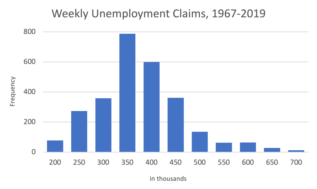
The average claims filed per week falls somewhere around 350,000, with a minimum of about 200,000, and a maximum of approximately 700,000.
Where do the last four weeks fall on this histogram?

To fit data from the last four weeks into the histogram, we have to smash the previous 53 years of data to the far left. It’s visually clear that recent unemployment data is far above anything previously, but how far above, precisely?
Statisticians use a measure called standard deviation (represented with the Greek letter sigma) to measure how far away from the mean a particular observation is. When speaking of standard deviations, we’re usually dealing with single digits. In a standard normal distribution, 99.7% of all data points fall within three standard deviations below and three standard deviations above the mean. Six Sigma, a technique of improving processes until they’re 99.99966% efficient, is so named because the idea six standard deviations is extreme.
Using standard deviations, how abnormal are the last four weeks of unemployment claims? The week ending March 21, which saw 2.92 million applications for unemployment, was 29 standard deviations above the mean. The week ending April 4, which saw 6.21 million applications, was 66 standard deviations above the mean. The United States has never before seen unemployment at this speed.
Size
To comprehend the enormity of unemployment claims, let’s translate 22,034,000 into a map. What if we took everyone who’s filed for unemployment and lined them up, in an appropriate-for-social-distancing line, everyone six feet apart, starting in Boston? How long do you think that line would be?
The line of unemployed adults would stretch from Boston to Seattle.
Then down to San Diego.
Then over to Miami.
And back up to Boston…
THREE TIMES!
(Technically, you would finish the line 300 miles short of Boston on the last lap, BUT STILL). The line would be 25,038 miles long.

If you drove with your hand out the driver’s side window, at 75 miles per hour, high-fiving everyone in that line (something I don’t recommend for several reasons), it would take two full weeks to get to the end of the line. That’s two weeks with no stopping for bathroom breaks, no stopping for food, and no stopping for gas.
Economic Momentum
In physics, the effect one moving object will have on another is calculated using momentum, defined by multiply mass (size) times velocity (speed). The two visualizations above demonstrate the size and speed of the recent shock to USA employment. Given the economic momentum of the last four weeks, I think it’s going to take some time for the country’s economy to recover.
Update
I’ve rerun the numbers with two more weeks of unemployment claims, comparing six week intervals, posted here.

2 thoughts on “Visualizing the Unprecedented Speed and Size of Unemployment”